It’s a great feat when a customer stops by your online store. It’s an even greater success when they spend twenty minutes browsing your online store. They find the perfect product, read the reviews, and finally click the buy button. They are ready to give you their money. Then, for a reason you cannot quite identify, they stop. They close the tab and never come back. This is the invisible leak in your business.
Every day, potential profit drains away because of small, unnoticed hurdles in your payment flow. If you want to cut this loss without lowering your prices or increasing the amount of money you use on your ad budget, you need to master checkout A/B testing. This process allows you to stop guessing what your customers want and start using real data to build a frictionless buying experience.

Why Checkout A/B Testing Beats Guesswork in Payment UX
Most business owners spend a fortune on marketing to get people to their site. They obsess over product descriptions and social media ads. However, the final few inches of the customer journey often get the least attention. If this resonates with you, know that this is a mistake. The link between checkout friction and lost revenue is direct and measurable. When you make a customer work too hard to pay you, they will eventually quit.
You might think you know what your customers prefer, like a single-page checkout is always better, or that a specific button color is the most effective. These are just assumptions. The reality is that every audience is different. A high-end luxury shopper behaves differently from someone buying discount bulk supplies.
This is why checkout A/B testing is your most powerful tool. It allows you to run controlled experiments where you show two different versions of your payment page to different groups of users. By measuring which version results in more completed sales, you gain clarity that no “best practices” article can provide.
Foundations of Checkout A/B Testing
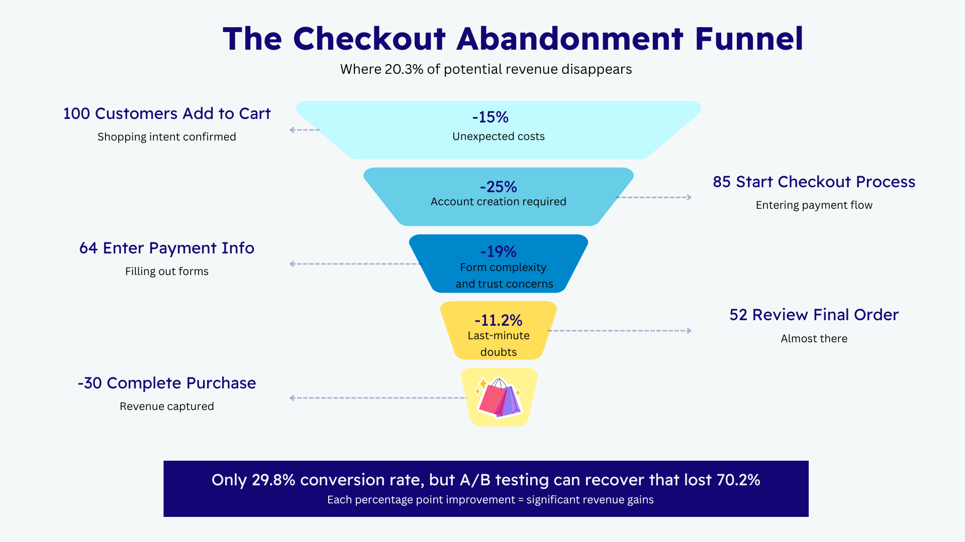
Evidence shows how much room for improvement exists in the average online store. Based on an analysis of 49 different studies, the average cart abandonment rate across all eCommerce sites is 70.2%. This means seven out of every ten people who show intent to buy do not finish the transaction. You can significantly lower this number by refining your payment user experience.
Before you change a single button on your site, you must establish what you are measuring. Most people look only at the final conversion rate. While that is the most important metric, it does not tell the whole story. You should also track your approval rate and your abandonment rate at specific steps. For instance, if you see a huge drop-off after the shipping costs are revealed, your problem is not the payment form. It’s your pricing transparency.
Designing a proper test requires a clear hypothesis. A good hypothesis sounds like this: “If I remove the requirement to create an account, then more customers will complete their purchase because the friction of password creation is removed.” Once you have a hypothesis, you need a sufficient sample size.
Running a test for two days with fifty visitors will not give you reliable data. You need enough traffic to ensure the results are not just a statistical fluke. Generally, you should run a test for at least two full business cycles, which is usually two weeks, to account for different shopping behaviors on weekends versus weekdays.
High-Impact Elements to Test in Your Checkout
The layout of your page is often the first thing that causes a customer to hesitate. You should experiment with the number of form fields you require. It is a common temptation to ask for as much data as possible for marketing purposes. However, every extra field you add increases the chance of a user giving up. Research from the Baymard Institute shows that nearly 1 in 5 shoppers abandon their cart due to a long or complicated checkout process.
Try testing a version of your checkout that only asks for the bare essentials. You might find that removing a “How did you hear about us?” field increases your completion rate by a noticeable margin.
Another high-stakes area for checkout A/B testing is the debate between guest checkout and forced account creation. Many businesses want to force users to create accounts to build a mailing list. However, this often acts as a massive roadblock.
In fact, 1 in 4 users abandon their carts because the site requires them to create an account. It would be wise to test guest checkout against forced account creation to see how much revenue you might be sacrificing for those email addresses.
Payment Method Presentation Tests
If you accept credit cards, Apple Pay, PayPal, buy now, pay later, and ACH, the order in which they appear matters. How you present your payment options can change how a customer perceives the ease of the transaction. For mobile users, seeing a digital wallet option like Apple Pay or Google Pay at the very top can lead to a faster checkout.
Many mobile users have their card details safely stored in their phones. So offering the convenience of mobile payments first is a huge selling point because this option eliminates the need to type in card numbers and makes the sale that much easier.
You should also consider testing contextual payment options. This means showing different payment methods based on the customer’s location or the total value in their cart.
What does that mean? If a customer is buying a high-ticket item worth several thousand dollars, they might prefer a buy now, pay later option over putting it all on their credit card. Credit cards have limits, and many cardholders may not have enough available funds to cover the cost of the transaction.
Conversely, for a small twenty-dollar or less purchase, a digital wallet is the most convenient route. When you test the prominence of these different payment methods, you can better align your checkout with the specific financial habits of your buyers.
Trust, Security, and Transparency Experiments
Trust and security are major hurdles in online shopping. 19% of customers will not complete checkout if they do not feel that their information is safe. You should test the placement of trust badges and security icons. Some merchants find that placing a “Secure Checkout” badge right next to the “Pay Now” button increases confidence. Others find that too many badges can actually make a site look cluttered or even suspicious.
Transparency regarding the final price is equally vital. There is nothing a shopper hates more than getting to the final screen and seeing a sudden “service fee” or an unexpected shipping charge. In fact, 47% of shoppers will abandon their cart if they can’t see the total order cost upfront.
Test how and when you display any added taxes and fees. A checkout that shows the total cost early on in the process is sure to perform better than one that hides it until the last second. Clarity in your pricing is one of the easiest ways to build trust and reduce last-minute site departures.
Mobile Checkout Optimization Tests
Mobile traffic now accounts for a massive portion of online sales, yet mobile conversion rates are often lower than desktop rates. This is usually due to poor design. On a small screen, every tap is an opportunity for a mistake. You must focus your payment page testing on mobile-specific friction.
Test things like autofill capabilities and the size of your buttons. A button that is too small for a thumb to hit easily is a conversion killer. You should also look at page load speeds. When page load time is delayed from 1 to 3 seconds, the chance of a user bouncing increases by 32%.
Testing a lightweight, mobile-first version of your checkout against your standard responsive design can reveal if your current setup is too heavy for users on slower cellular connections.
Analyzing Test Results and Rolling Out Winners
Once your test has run for a sufficient amount of time, you need to look at the data with a critical eye. It is easy to see a small lift and assume you have won. However, you must be careful about false positives. This happens when a change looks successful just by chance.
Don’t fall into the trap of overfitting your checkout to short-term trends. A change might increase conversions today but hurt your long-term brand reputation or increase your chargeback rate later. Always look at the big picture. Once you find a clear winner, roll it out to all your traffic. But your work does not stop there.
The best businesses maintain a continuous testing roadmap. They finish one test and immediately start the next one. This constant cycle of ecommerce conversion rate optimization is what separates market leaders from everyone else.

ECS Payments: A Partner in Your Transaction Optimization
You may not realize it, but choosing the right payment processor is just as important as the design of your checkout page. Many processors provide a “black box” service where you have very little control over the actual transaction flow or the data you receive. This makes it incredibly difficult to perform effective checkout optimization.
At ECS Payments, we understand that every millisecond matters to your bottom line. We are a trusted partner for eCommerce merchants of all kinds who want to scale their business. Unlike many generic processors, we provide a deep level of integration and transparent reporting.
We offer a robust suite of tools that allow you to customize your payment experience to fit your unique business needs. When you work with us, not only do you have access to top-of-the-line payment solutions, but you also get a partner dedicated to helping you refine your entire payment ecosystem. Our focus is on reliability, security, and giving you the flexibility to innovate without being held back by rigid, outdated systems.
Start Your First Checkout Test Today
Improving your checkout experience does not require a massive overhaul of your site. It especially does not require a price cut on your products. It requires a commitment to observing how your customers actually behave. You can start small. Pick one element, perhaps your guest checkout option or the order of your payment methods, and set up an A/B test this week.
To help you get started, we recommend following this simple checklist for your first A/B experiment:
- Identify one specific point of friction in your current sales funnel.
- Clearly state your hypothesis in writing.
- Ensure your tracking tools are correctly capturing every step of the process.
- To avoid making premature decisions, set a firm end date for the test.
- If the results are statistically significant, analyze the data and implement the change.
If you are ready to take your business to the next level and need a payment processor that supports your growth through every test and every sale, reach out to us at ECS Payments. We can help you build a checkout experience that doesn’t just process payments but actively grows your business.